Ensure the font aligns with your brand’s values and personality. For example, a modern tech startup might choose a sleek, minimalistic sans-serif typeface, while a traditional law firm might prefer a classic serif font to project trust and stability.
2. Prioritize Readability
The font should remain clear and readable across different sizes and formats. Avoid overly decorative or intricate fonts that may become illegible when scaled down or viewed from a distance.
3. Versatility Across Platforms
Choose a font that maintains consistency and effectiveness, whether displayed digitally, in print, or on various merchandise. The selected typeface should adapt well to diverse media without losing clarity or impact.
4. Timelessness Over Trends
Opt for fonts that offer classic appeal and longevity rather than fleeting design trends. A timeless font choice ensures your logo remains relevant and avoids frequent redesigns.
Recommended Professional Fonts
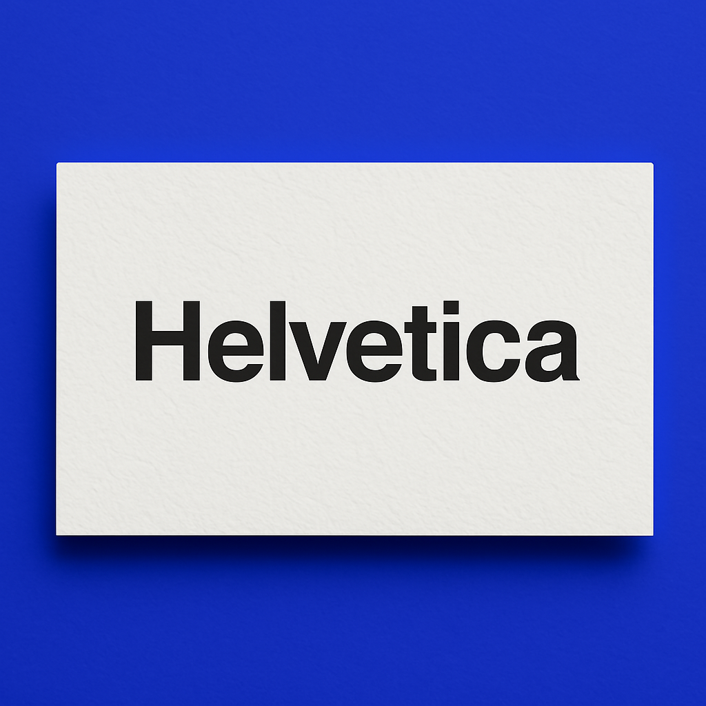
Helvetica
A versatile and widely recognized sans-serif font, known for its clean, neutral appearance. Ideal for brands seeking simplicity and clarity.
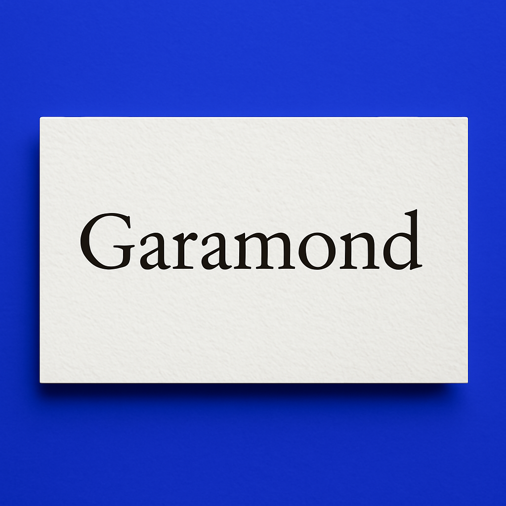
Garamond
An elegant serif typeface frequently used in publishing and academia, valued for its readability and traditional sophistication.
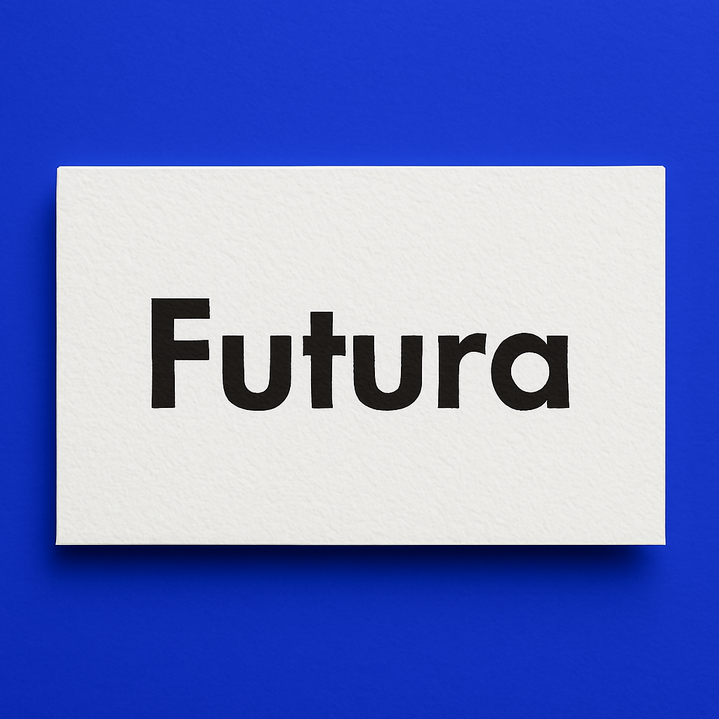
Futura
A geometric sans-serif typeface known for its modern and streamlined look, perfect for innovative and progressive brands.
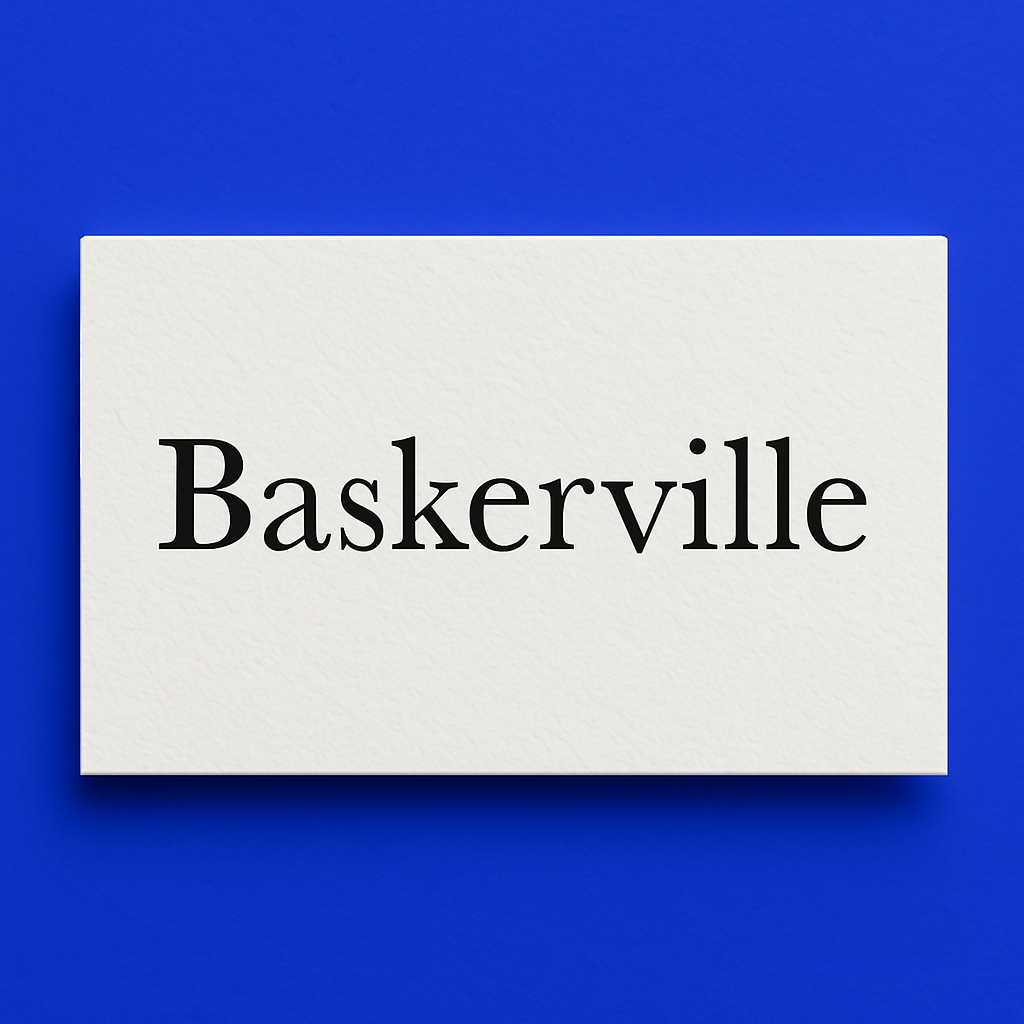
Baskerville
A transitional serif font that strikes a balance between classic and contemporary styles, offering a refined and professional appearance.
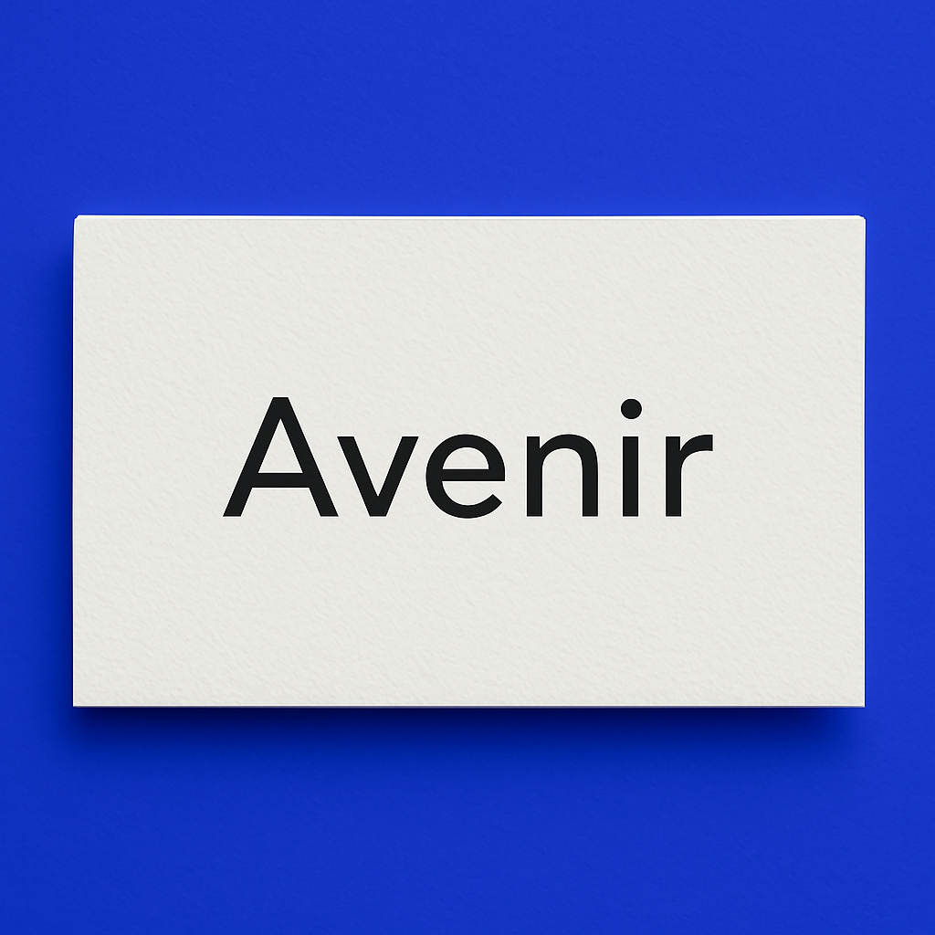
Avenir
Combines geometric precision with humanistic touches, providing a harmonious look suitable for various corporate identities.
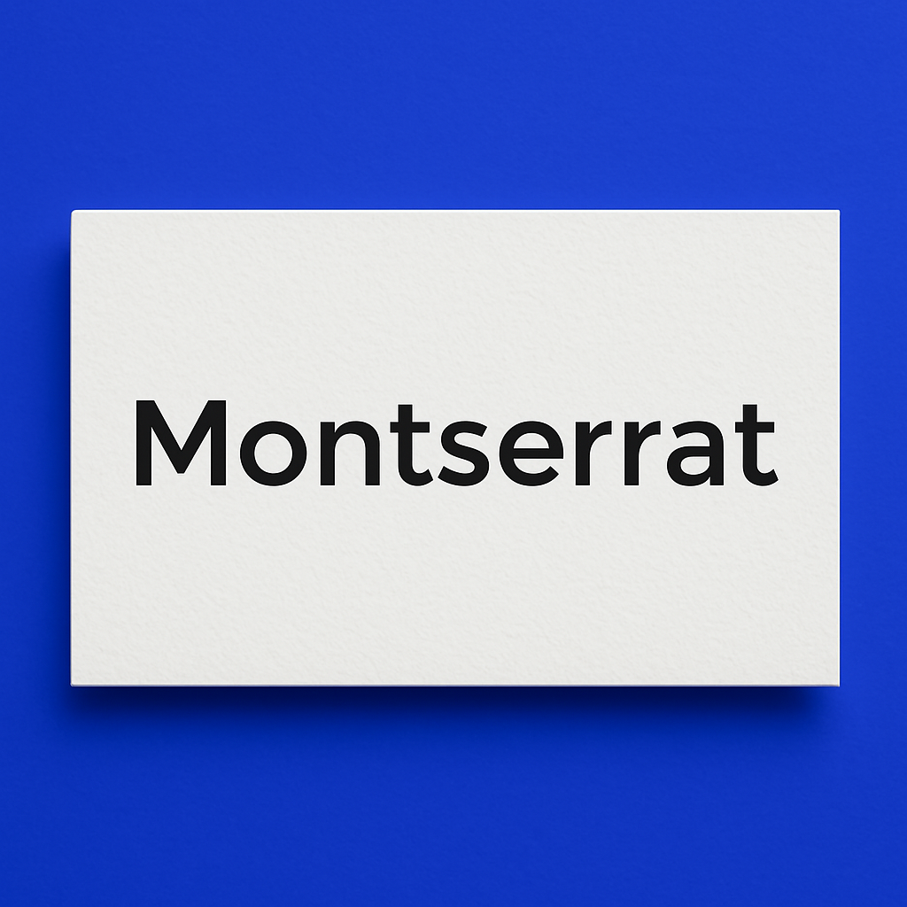
Montserrat
A modern sans-serif typeface inspired by urban signage, featuring clean lines and a friendly aesthetic that appeals broadly.
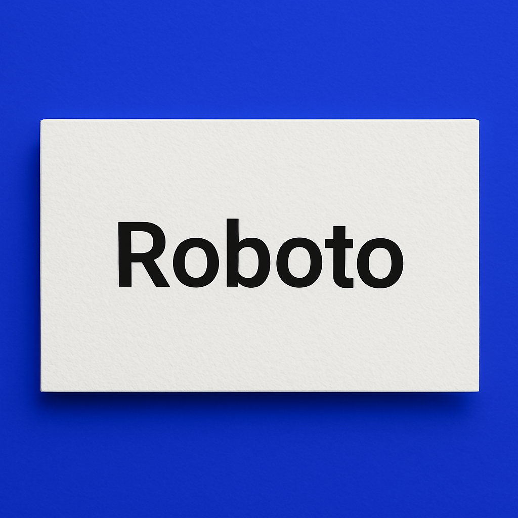
Roboto
Designed for digital readability, Roboto is a contemporary sans-serif font widely used in web and digital media.
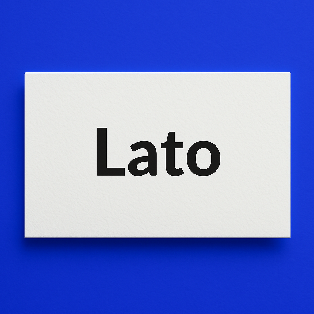
Lato
Known for its warm, stable appearance, Lato suits corporate and technology-focused brands that want a welcoming yet professional vibe.
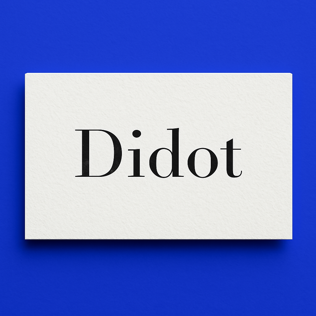
Didot
A high-contrast serif typeface associated with luxury and fashion, ideal for premium and upscale branding.
Conclusion
Selecting the appropriate font for your logo involves thoughtful consideration of your brand’s identity, audience, and intended message. Focusing on readability, versatility, and timelessness will help you create a logo that not only looks great but also stands the test of time, supporting your brand’s long-term success.