HomeAvoiding Common UI/UX Design Mistakes: Lessons from ZAKKA’s Nutrition App
Avoiding Common UI/UX Design Mistakes: Lessons from ZAKKA’s Nutrition App
by
Zakka
User interface (UI) and user experience (UX) design are fundamental to how people engage with digital products. Whether it’s a website or a mobile app, users expect clarity, consistency, and an intuitive flow. At ZAKKA, our recent work on a personalized nutrition app highlighted both the challenges and the opportunities of thoughtful UI/UX design. By walking through this project, we’ll explore the most common design mistakes—and how we addressed them.
The nutrition app’s mission was simple: deliver AI-personalized dietary insights through an easy-to-use and visually pleasant experience. From day one, our focus was on reducing friction and encouraging positive user interaction.
Establishing a Clear Visual Hierarchy
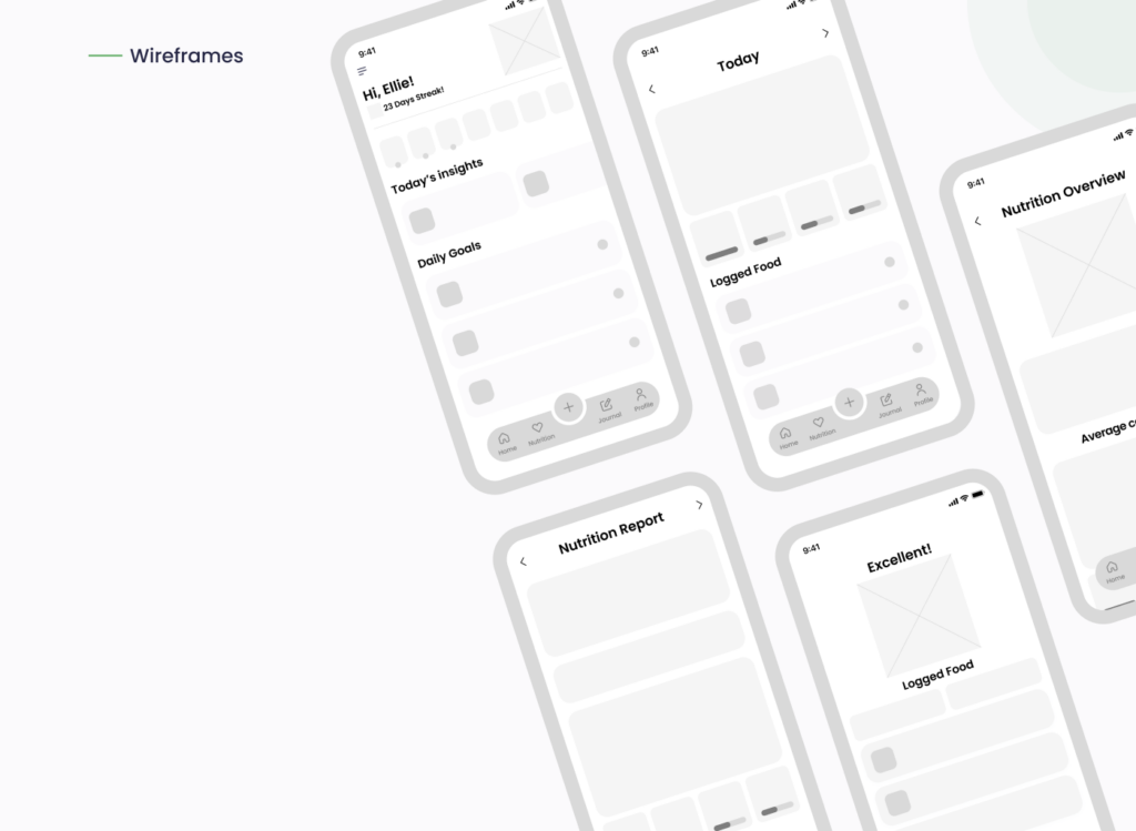
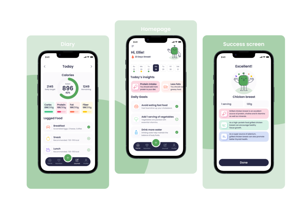
In early stages, wireframes helped us establish a structure that put users at ease. (See wireframe visuals above.) We prioritized visual hierarchy using size, spacing, and contrast—guiding users from the most important insights (like calories consumed) to actionable items (like “Add 1 serving of vegetables”). This clear structure kept the interface focused and minimized cognitive overload.
Maintaining Consistency Across Elements
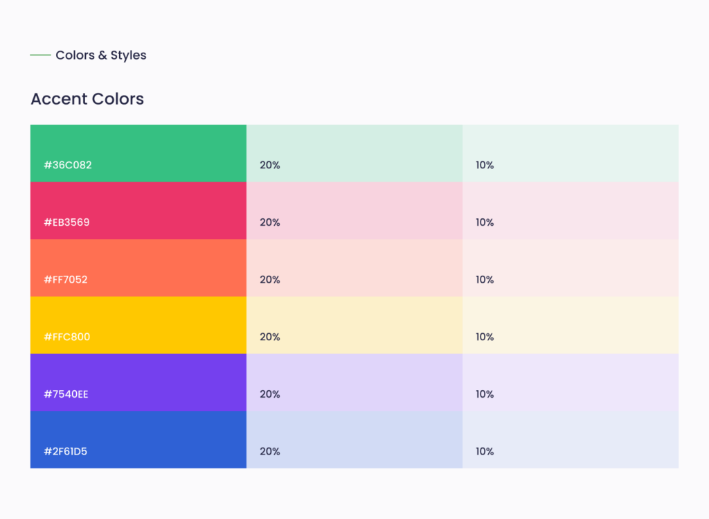
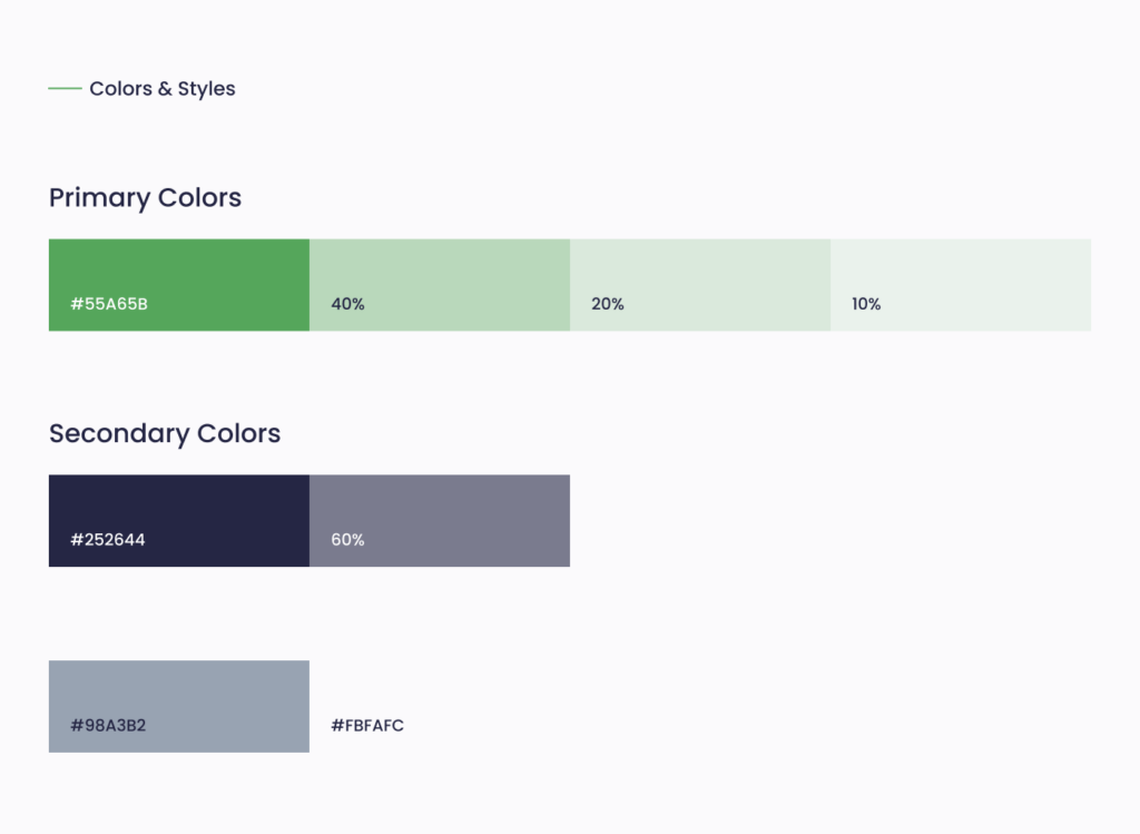
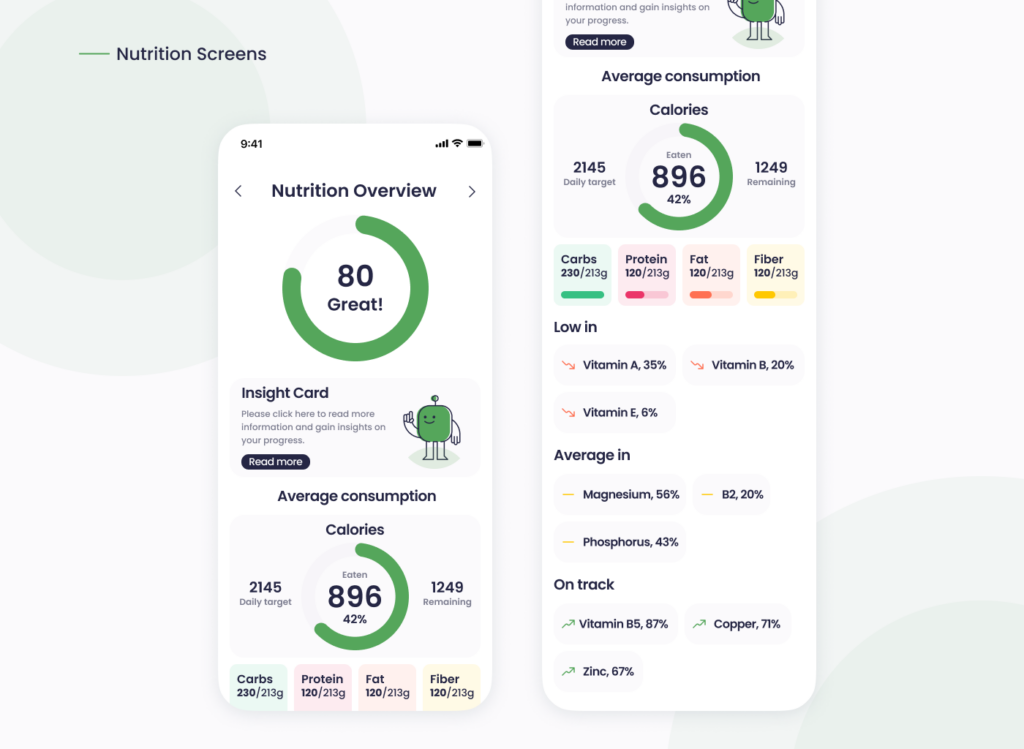
From typography to button styles and icons, consistency was key. Our style guide featured structured font scaling (see typography chart) and a refined color palette (shown above) that balanced primary colors like #55A65B with supportive neutrals and accents. This maintained visual harmony throughout the app and built user confidence.
Inconsistent design elements often confuse users. For example, using different button shapes or random hover effects dilutes usability. Our strict adherence to a component system avoided this mistake.
Designing for Mobile from the Start
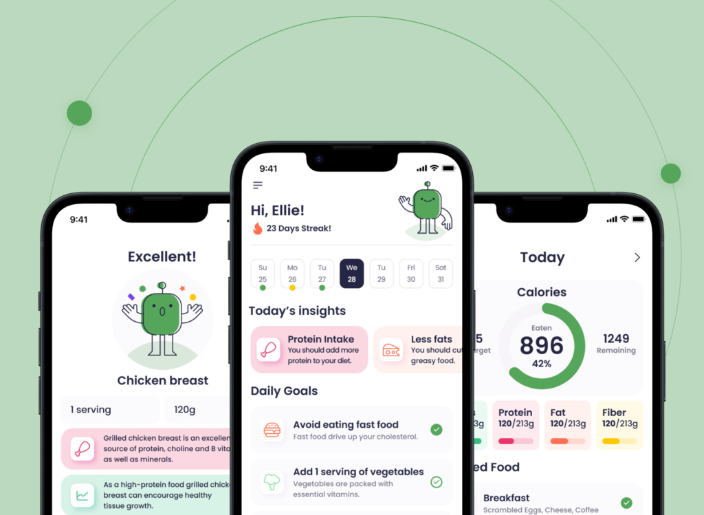
Although the nutrition app was created as a conceptual design, it was developed with a mobile-first mindset in mind. From the nutrition diary to success screens, every layout was envisioned to work seamlessly on small screens without sacrificing clarity. Visual feedback elements—such as animated progress indicators or celebratory success messages—were considered to enhance interactivity and intuitive flow (see screenshots of the Success Screen and Diary).
Even as a design concept, mobile responsiveness was treated as a core priority. ZAKKA’s approach ensured that the app would remain elegant and efficient if implemented across different devices.
Without mobile responsiveness, interfaces feel broken. ZAKKA’s responsive design process ensured that the nutrition app remained elegant and efficient, no matter the device.
Keeping It Simple—Not Basic
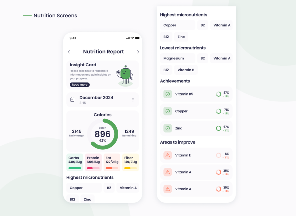
The temptation to overdesign is real. Too many metrics, too many icons, or unclear labels often result in a crowded experience. We limited choices per screen and layered functionality using expandable cards and progressive disclosure. For instance, micronutrient data was shown only when relevant, avoiding information overload (see Nutrition Report section).
Writing with Empathy and Testing with Real Users
UX isn’t just about visuals. The tone of voice was friendly, supportive, and informative—never robotic. Labels like “Excellent!” or “Add 1 serving of vegetables” were chosen intentionally to motivate and guide users without ambiguity.
Although the app was not tested with real users, the design process was guided by common usability heuristics and industry best practices. Decisions were made based on established UI/UX principles, and potential pain points were carefully considered and addressed during the conceptual and visual development phases.
Conclusion: Strategy + Empathy = Results
What makes a digital product great isn’t flashy design. It’s the thoughtful decisions behind it—hierarchy, consistency, responsiveness, clarity, and empathy. Our work on the nutrition app is a reflection of ZAKKA’s philosophy: design should feel invisible, natural, and empowering.
Avoiding common UI/UX mistakes is not just about knowing what to avoid—it’s about having a process that centers users at every step. If your product needs clarity, polish, and engagement, ZAKKA can help you bring it to life.


